Puff Screen Printing for Logos, Text, and Graphics: What Each Use Case Demands
Puff screen printing is one of those techniques that looks simple until you try to execute it on the wrong design. The foam agent that causes the ink to rise off the fabric doesn't discriminate — it expands everything uniformly. That's a feature when your design is built for it. It's a production problem when it isn't.
Most buyers come to puff printing with one of three briefs: a logo, a text-based design, or a graphic. Each one demands a different approach — different artwork preparation, different stitch and screen decisions, and different expectations about what the finished product will look like.
Here's what each use case actually requires, and what three of our recent puff projects show about how those decisions play out in production.
Puff for Logos
A logo on a puff print is the use case where the technique is most often misapplied. Not because logos can't be puffed — they can — but because most logos weren't designed with foam expansion in mind.
The expansion that makes puff visually distinctive is also what destroys fine detail. Thin stroke weights close up. Tight letterforms in secondary text blur. Small registered trademark symbols or taglines — the kind of elements that sit cleanly in a flat screen print — become illegible once the foam activates.
- What the design needs: Simplified. The logo needs to be reduced to its most essential geometric and typographic forms. If the original has hairline elements, they either get removed or converted to something thick enough to survive expansion. If the logo has both a primary mark and supporting text, the supporting text is almost always better handled as flat ink while the primary mark is puffed — the combination gives you dimension where it reads best and legibility where you need it.
- The tonal approach. One of the most sophisticated ways to puff a logo is tonally — matching the ink color to the garment so the design reads as texture rather than color. The logo is present, dimensional, and visible under direct light, without the contrast that calls attention to itself. This works especially well for brands where subtlety is part of the identity.
- Project example: Kulri Clothing — Tonal Puff on UpCycle LA Lavender Crewnecks 850 UpCycle LA lavender crewnecks with tonal lavender puff ink — matched to the garment color, custom woven labels included. The logo reads as dimension on the chest rather than as a color element. Achieving a true tonal match at this scale requires precise ink mixing before production and a stitch-out approval to confirm the shade relationship between ink and fabric before the full run commits.
Puff for Text
Text is where puff screen printing performs most naturally — and where the technique's visual character is most at home. Bold, heavy letterforms expanded into a raised surface is the look that defined streetwear graphics across decades. It's still the primary reason brands reach for puff.
- What the design needs: Weight. Letterforms need stroke widths that are thick enough to survive expansion cleanly. A bold condensed typeface or a chunky block serif will expand and hold its shape. A thin-weight typeface will blur at the edges and lose the crispness that makes the raised effect worth having.
- What to watch for: Multi-line text arrangements where the spacing between lines is tight. Expansion adds physical mass, which means adjacent lines of text can feel closer or even touch after curing. The design needs looser leading than it would for flat printing.
- Project example: Puff Pink Ink on Independent Trading Co. SS4500 Midweight Hoodies 750 Independent SS4500 chocolate hoodies with raised puff pink ink on M&R Challenger automatic presses, completed in 4 business days. The contrast between the chocolate blank and the pink puff ink is sharp and intentional — the raised surface catches light differently than flat ink would on the same combination, giving the typography a presence that photographs and wears differently. The SS4500's midweight cotton-blend construction provides the surface stability puff requires to activate consistently across a 750-piece run.
Puff for Graphics
Graphic applications are where puff printing has the most room to be interesting — and where the design constraints are strictest. A full graphic in puff is not a flat illustration with foam added. It has to be designed as a puff piece from the start.
- What the design needs: Bold shapes with defined, clean edges. Think poster-style artwork: strong silhouettes, solid fills, outlines with enough weight to survive expansion. Any element that relies on fine-line detail, small internal structure, or nuanced gradients should be removed or reworked.
- Color management. Multi-color puff work adds production complexity — each color requires its own screen and its own pass through the press, and registration between puff layers has to be tighter than in flat printing because the physical mass of each channel can interact visually at the edges. Colors that sit adjacent to each other need enough separation in the artwork that the expanded edges don't bridge.
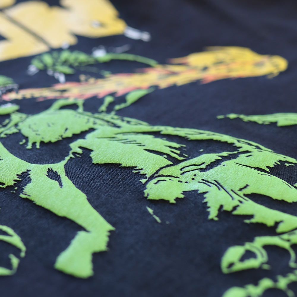
- Project example: The Saddest Faction — Multi-Color Puff on TeeStyled TS7000 Tees 750 TeeStyled TS7000 tees with puff screen printing in yellow, green, and red raised plastisol inks, delivered in 8 business days. Three color channels in puff is a setup that requires each element to occupy its own defined zone — colors that share an edge in flat printing can bridge when the foam activates, creating a merged edge where the design intended separation. The three-color palette here was structured so each color operates in its own area, which kept the expansion predictable and the finished graphic clean.
The File Setup Requirement Across All Three
Regardless of the use case, puff screen printing requires vector artwork or 300 DPI raster at actual print size. Text below ½ inch tall is high-risk for legibility after expansion. Line weights below 2pt should be thickened or removed. Gradients and soft edges don't translate to puff — they need to be converted to solid fills before the file goes to screens.
We review every puff print file before it goes to screens. If something in the design will cause a production problem — text that's too small, a line that's too thin, a color adjacency that will bridge — we flag it before production begins.
Explore our puff screen printing service → Request a quote — we respond within two hours.